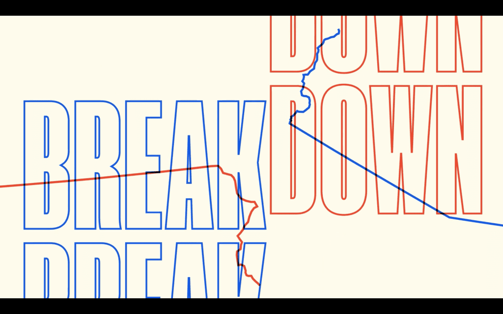
As with any day with a national news story unfolding—but especially on potentially one of the most consequential days in American history—VICE News Tonight obsessed over how to differentiate itself from the crowd of media outlets anticipating the 46th president. The graphics team knew the first step to do so came from the look of the show, so they steered left from what’s typical of cable news coverage. That meant instead of gradient backgrounds with flowing American motifs, VICE News’ Election Show used a solid color scheme with blockier outlining. Instead of regal lettering, large impact font. Instead of classic smiling portraits of the sitting president and the opposing candidates, cropping them slightly off-frame for the slightly irreverent tone. The blunter grapher scheme reflects VICE News’ Election Show purpose: To cut through the formalities and bromides to tell viewers what they need to know as frankly as possible.
A system of motion graphic elements presented within the context of an event (e.g. award show, concert, sporting event, news event)
